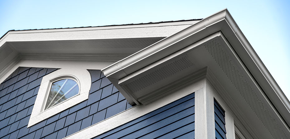
Make your house the talk of the block with color. For lasting color, only James Hardie’s exclusive ColorPlus® Technology provides color you can count on.
THE QUEST FOR PERFECT COLOR
All James Hardie® siding and trim products are available primed and ready for
field painting. But when you invest in ColorPlus® Technology, you won’t only get
gorgeous color—you’ll get color that lasts longer than a typical paint job.
DURABLE FINISH
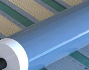
We apply multiple coats (50 percent more than your average house painter uses) of our proprietary finish to every surface and edge of our siding and trim, leaving no spot uncovered.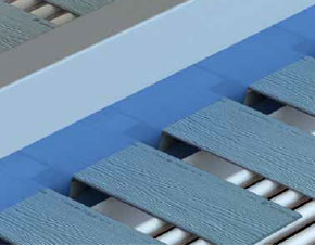
BAKED-ON BOND
Between coats, we cure the finish in a controlled environment for an even stronger bond that resists chipping, peeling and cracking.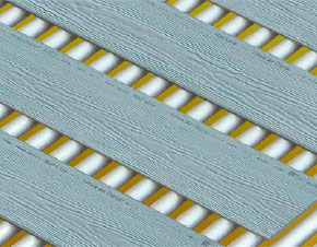
UV-RAY RESISTANCE
The Color Wheel
Understanding the basics is essential to choosing colors, so here’s a little Color Theory 101. Divided in 12 sections, the color wheel is a great tool for finding color combinations that are balanced and pleasing to the eye. Here are the most effective and frequently used color harmonies on the color wheel:
Analogous colors are colors right next to each other on the color wheel. Most commonly used in a combination of three on a house’s exterior, they work well together when you want to limit contrast and create a calm, serene color scheme.
Complementary colors are opposite each other on the color wheel. They involve two colors, such as red and green. Together, they generate the most contrast, especially when used in their purest, most vibrant form.
A triad is when you select a color and instead of using its complement, you use the two colors on either side of the complementary color, resulting in a three-color combination with low contrast.
Color Harmony
Color not only affects the way you think, act and feel, it can add value and substantial personality to your house. So, even though making decisions about which colors to use for your siding and trim feels overwhelming now, it’s all going to pay off in the end.
So, how do you use color to differentiate your house? The following guide lays out some of the basic principles of color theory, answers our customers’ most frequently asked questions, and shares some tricks from the pros.
Warm VS. Cool Colors
Colors are separated into warm and cool tones, based on their position within the color spectrum. Reds, yellows and oranges make up the warm side of the spectrum, whereas blues, purples and greens are cooler tones.
Warm colors evoke excitement. When juxtaposed with their cooler counterparts, warm colors appear larger, more prominent and easier to view. Cool colors are relaxing and calming.
Tricks Of The Trade
- Use a lighter trim color to draw attention to the trim
- Use a soft contrast between body and trim colors to make your home appear larger
- Use deeper body colors for a warm, cozy feeling
- Look for colors that align with your neighborhood or environment
- Use a third color for special details that you want to highlight
- Switch up body colors in horizontal bands, not vertical stripes.
HOUSE SIDING COLORS
Statement Collection™
The Statement Collection™ products feature your region’s most popular ColorPlus® Technology
colors. These siding and trim products are locally stocked and readily available
—so you can pick a favorite for your home today.
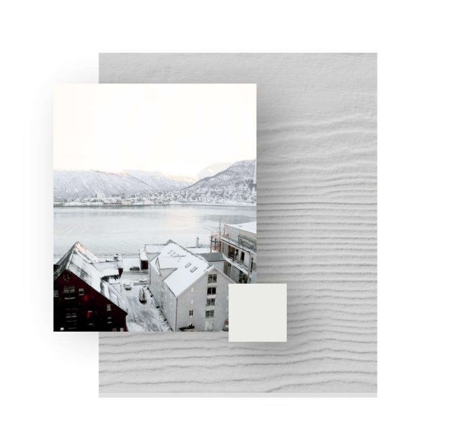
ARCTIC WHITE
Snowcapped mountains and the first flakes of winter: These pure whites are always the prettiest. Whether for the body of a home, or as an accent color alongside darker hues, classic white always has a place.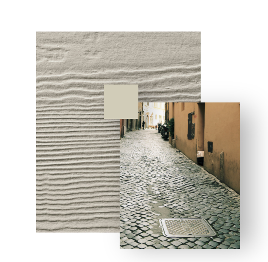
COBBLE STONE
Cobble Stone is a rich neutral that will look put together on any home. A taupe-based hue with warm undertones, it works particularly well with darker accent colors. No need to overthink this classic choice.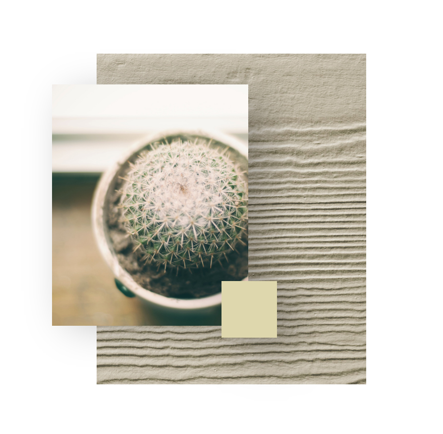
NAVAJO BEIGE
Navajo Beige is the kind of color than never goes out of style. A classic neutral, it works well with almost any stonework, creating a handsome combination that will fit into any neighborhood, or with any architectural style.
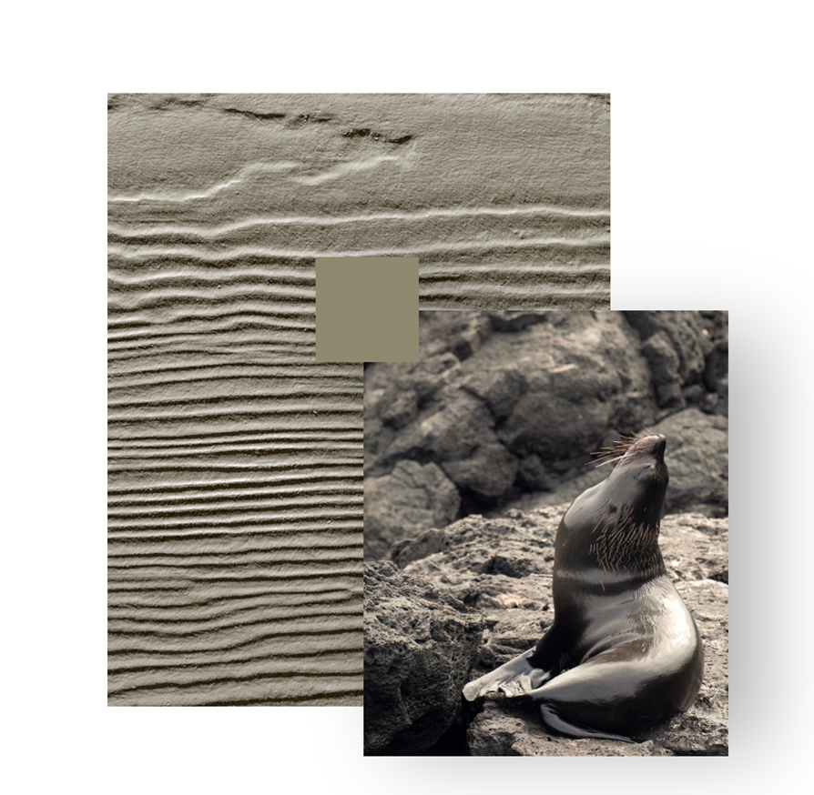
MONTEREY TAUPE
A taupe-based color with darker undertones, Monterey Taupe offers a sophisticated and striking neutral. This color works well paired with its softer cousin, Cobble Stone.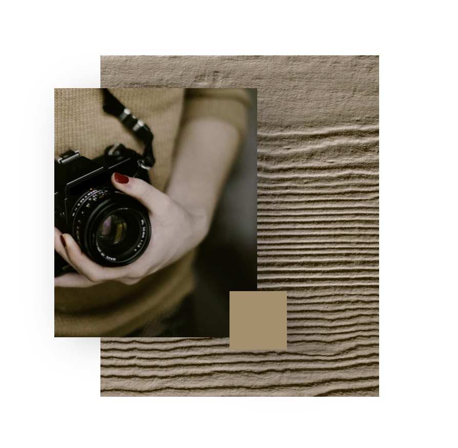
KHAKI BROWN
Like your favorite pair of khaki slacks, this warm, mid-tone brown pairs equally well with darker or lighter hues. Try it with Heathered Moss for a woodsy feel, or with Countrylane Red for a bolder look.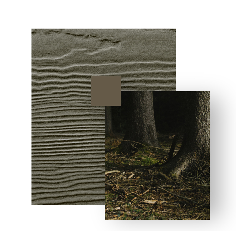
TIMBER BARK
The deep gray-brown of Timber Bark is pure elegance. Whether you choose it for the main body of your home, or as an accent, you won’t have to worry about it going out of style.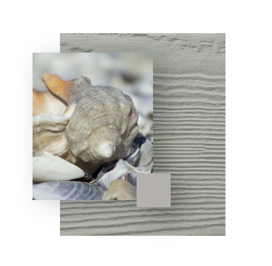
PEARL GRAY
This light neutral comes straight from the softest colors in nature, like sand and seashells. Use it as an understated accent, or for a whole house. Pearl Gray always feels elegant.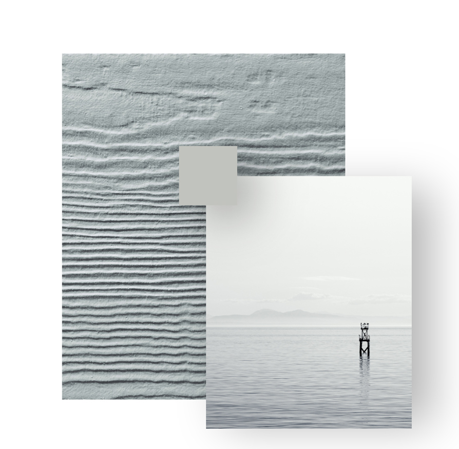
LIGHT MIST
Like the soft embrace of foggy day, this light gray tone with the softest hint of blue feels both cozy and cool. Think of Light Mist as a modern neutral that will lend a clean look to your home.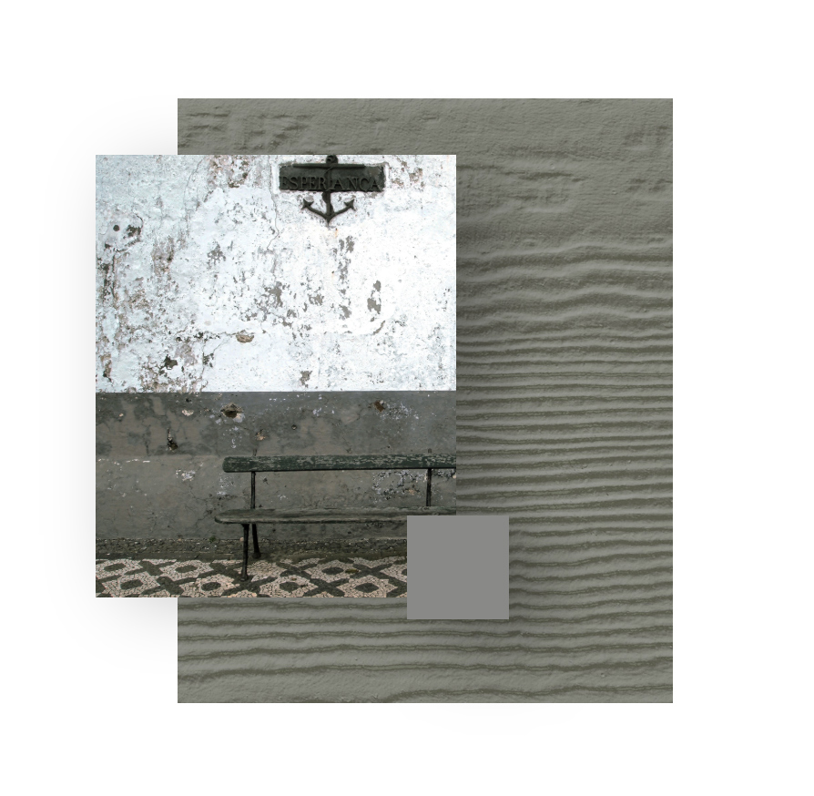
GRAY SLATE
Looking for a cozy, rustic neutral? Gray Slate can soften things up while adding an air of history. This is one of those timeless colors that works as an accent or whole house color. It also looks great with other shades of gray.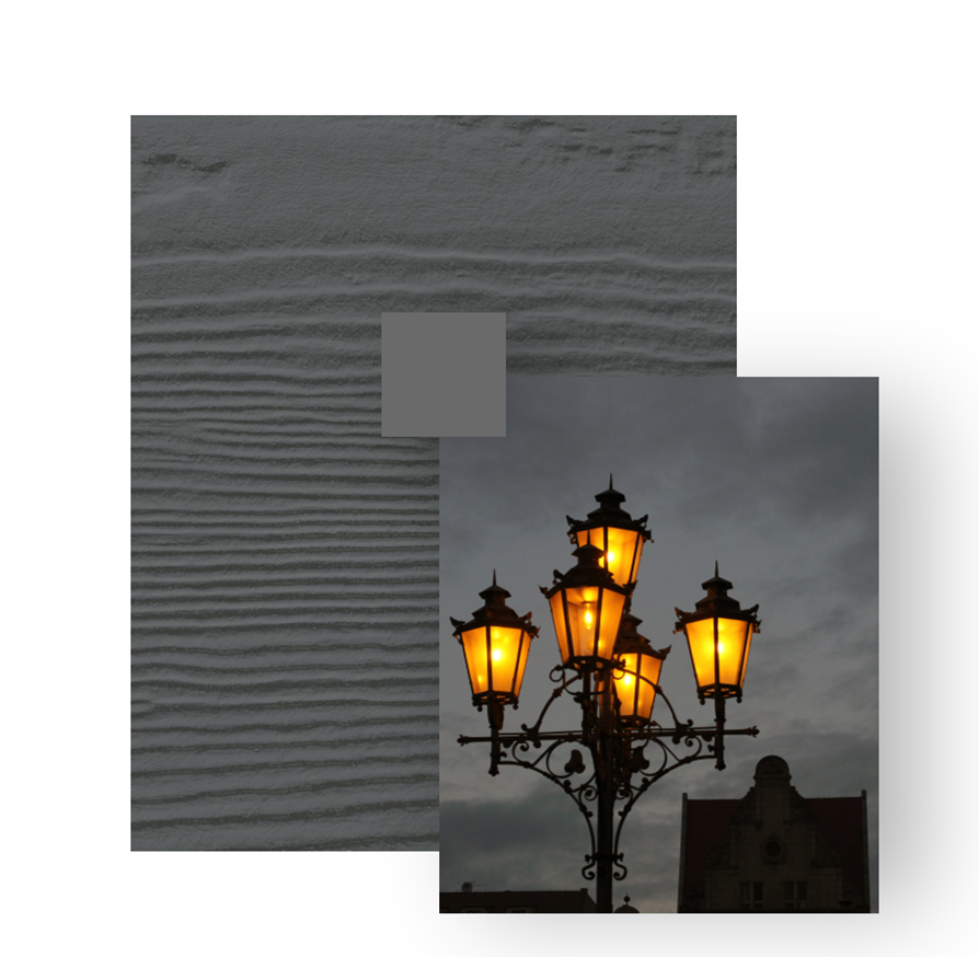
NIGHT GRAY
There is a certain romance to darkness and shadows. Dark hues evoke passion, mystery and sophistication. Night Gray will automatically add depth and drama to your home.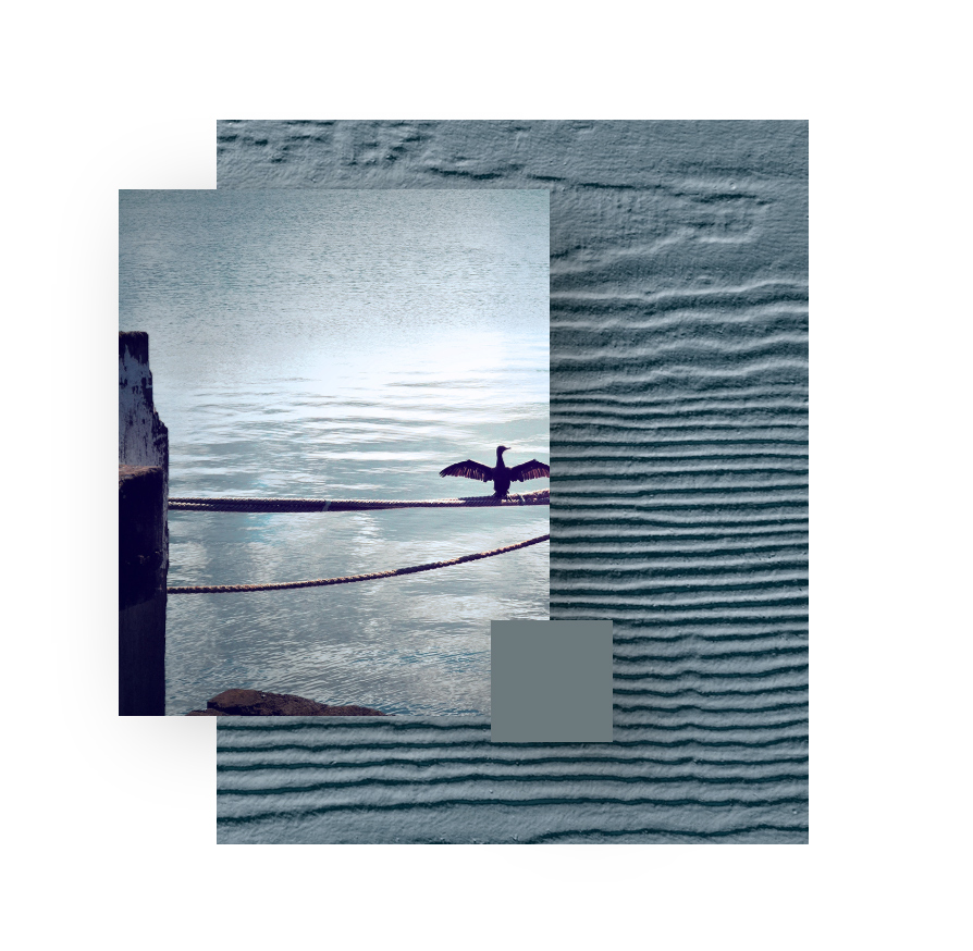
BOOTHBAY BLUE
Like sitting at the water’s edge just as the sun starts to set, Boothbay Blue has a soothing effect. It is the perfect shade for those who love blue and are looking for a softer option.
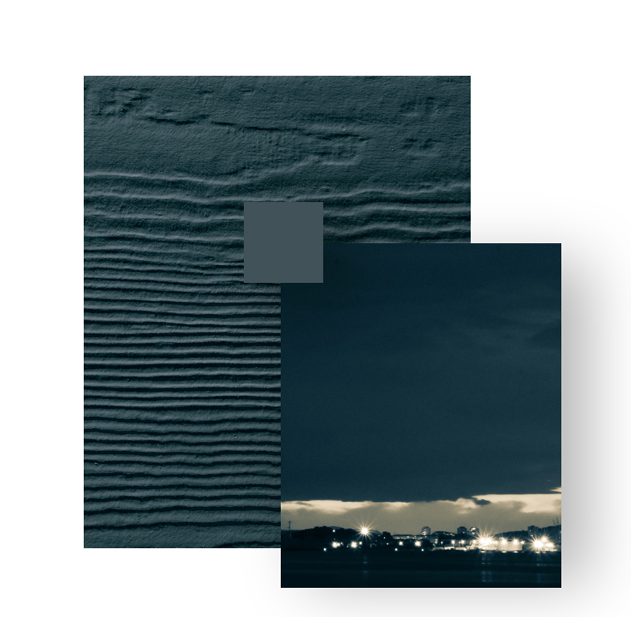
EVENING BLUE
Like a navy blue suit or a midnight-blue evening gown, there is nothing classier than a deep-blue house, whether nestled in the country or city. Evening Blue is a striking shade that works with nearly any style architecture.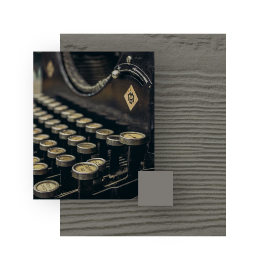
AGED PEWTER
Why do we love weathered grays so much? Because they are neutrals with personality. With its warmth and adaptability, Aged Pewter is the perfect complement to both beiges and other grays.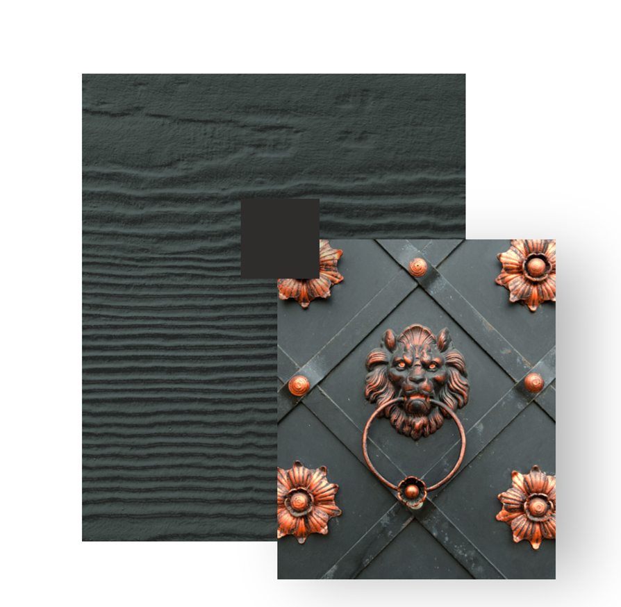
IRON GRAY
Create the house that everyone notices and admires, just like the unique doors all over old European cities. Iron Gray’s deep, bold shade provides a dramatic yet elegant look. Pair with Arctic White trim for a crisp combination that pops.
